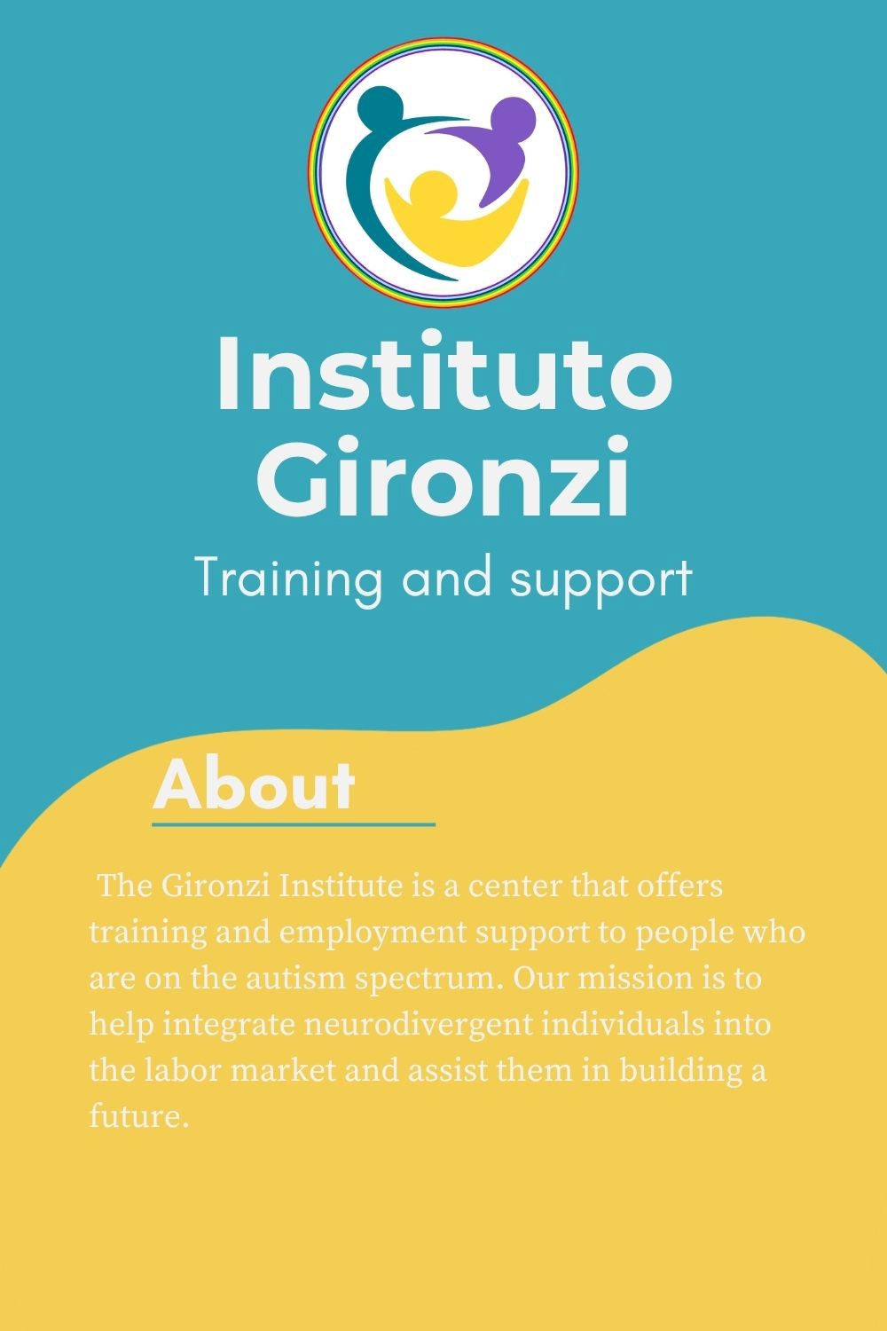
For this project, I developed a visual identity proposal for Instituto Gironzi, a center focused on training and employment support for people on the autism spectrum. The goal was to create a brand image that communicates inclusion, trust, warmth, and professional support through a cohesive visual system.
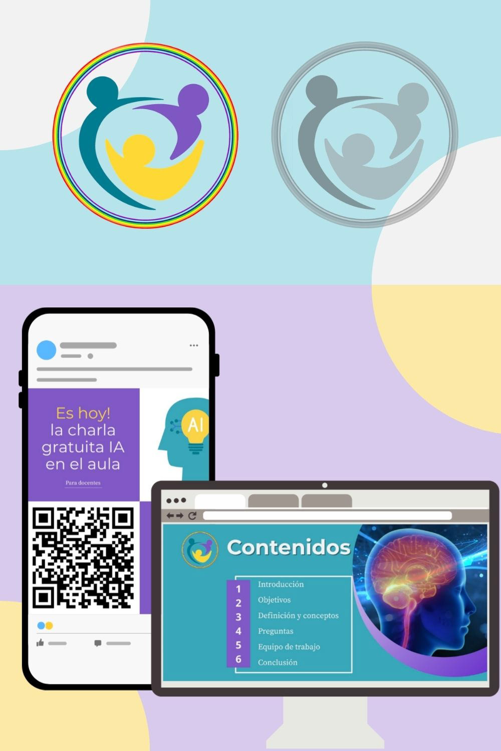
The project included the design of a logo system, a color palette, typographic selection, and sample digital applications for social media and educational or institutional presentations. Each element was designed to reflect the institute’s mission of helping neurodivergent individuals build skills, access opportunities, and strengthen their future.
My Approach
I focused on building a brand identity that feels friendly, accessible, and human-centered while maintaining a clear and professional look. The circular logo and interconnected figures were used to represent community, support, collaboration, and inclusion.
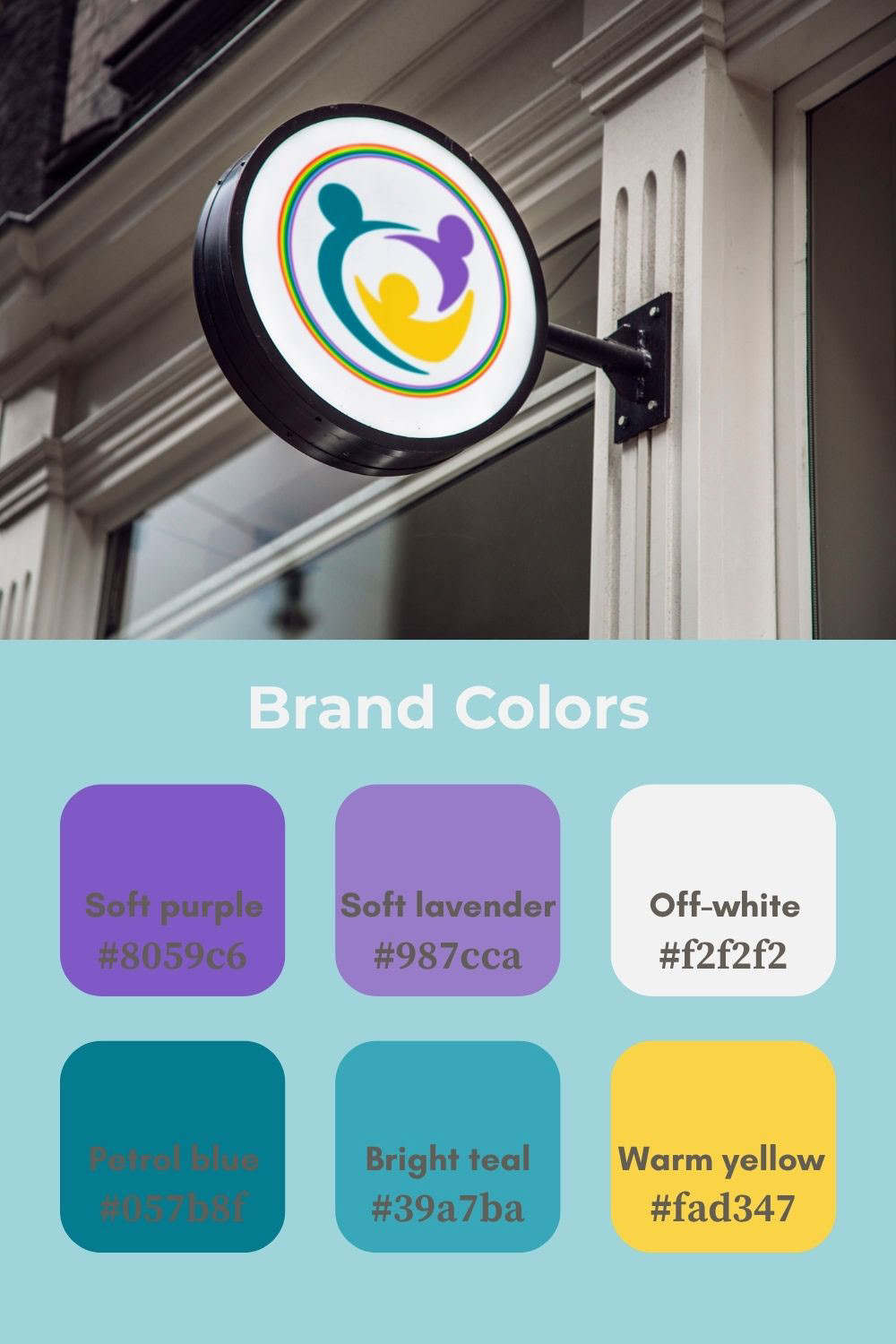
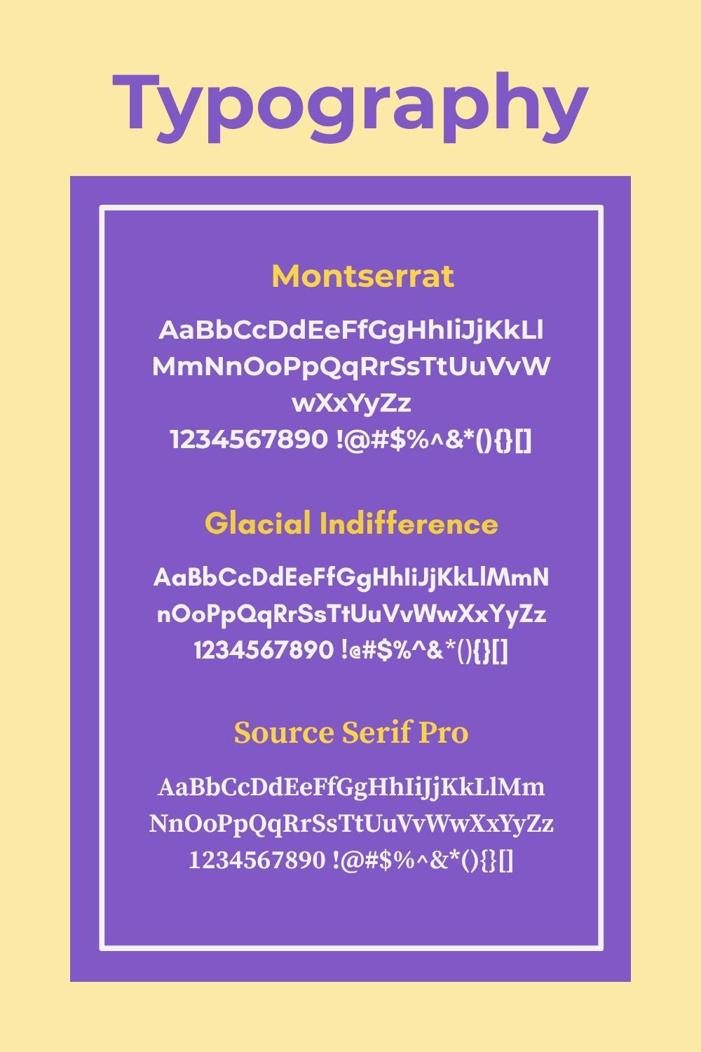
The selected color palette combines soft purple, lavender, teal, yellow, and off-white, creating a balance between calmness, optimism, and visibility. For typography, I explored fonts such as Montserrat, Glacial Indifference, and Source Serif Pro to achieve a combination of modern clarity and warmth.
Deliverables
This project included:
Brand logo exploration and application samples.
A curated visual color palette with accessible and recognizable tones.
Typography selection to support both digital and print communication.
Mockups for social media, website, and presentation use.
Project Value
This work reflects my interest in creating purpose-driven design solutions that connect communication, education, and inclusion. Beyond aesthetics, the project aimed to build a visual identity that supports the institute’s social mission and helps communicate its value clearly across different platforms.